The Stem Studio
A retro-floral identity for a plant and flower studio: bold blooms, kraft textures, and details made to be touched.
Overview
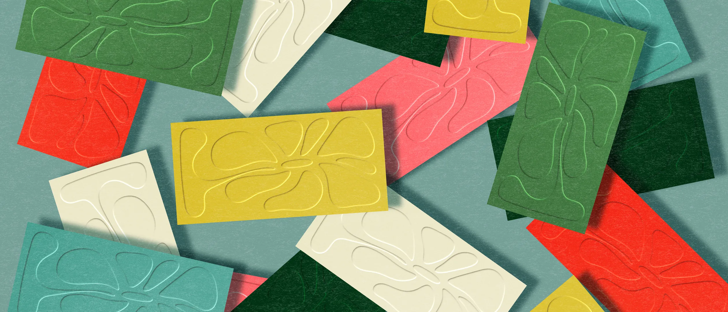
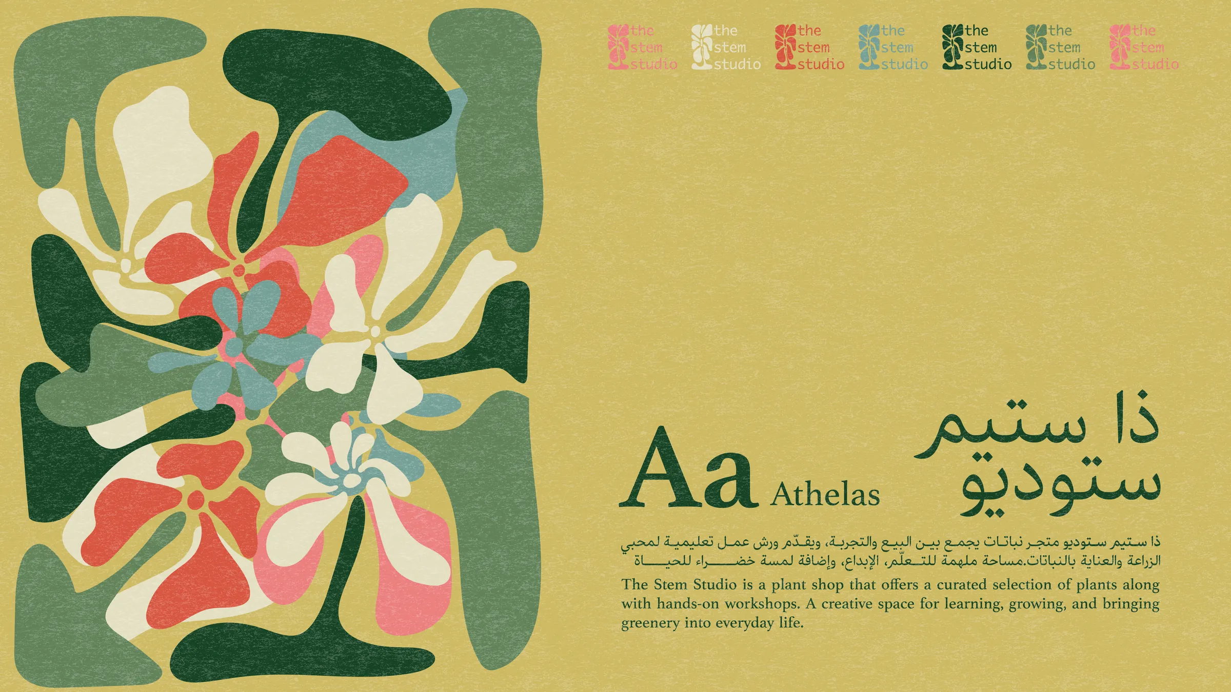
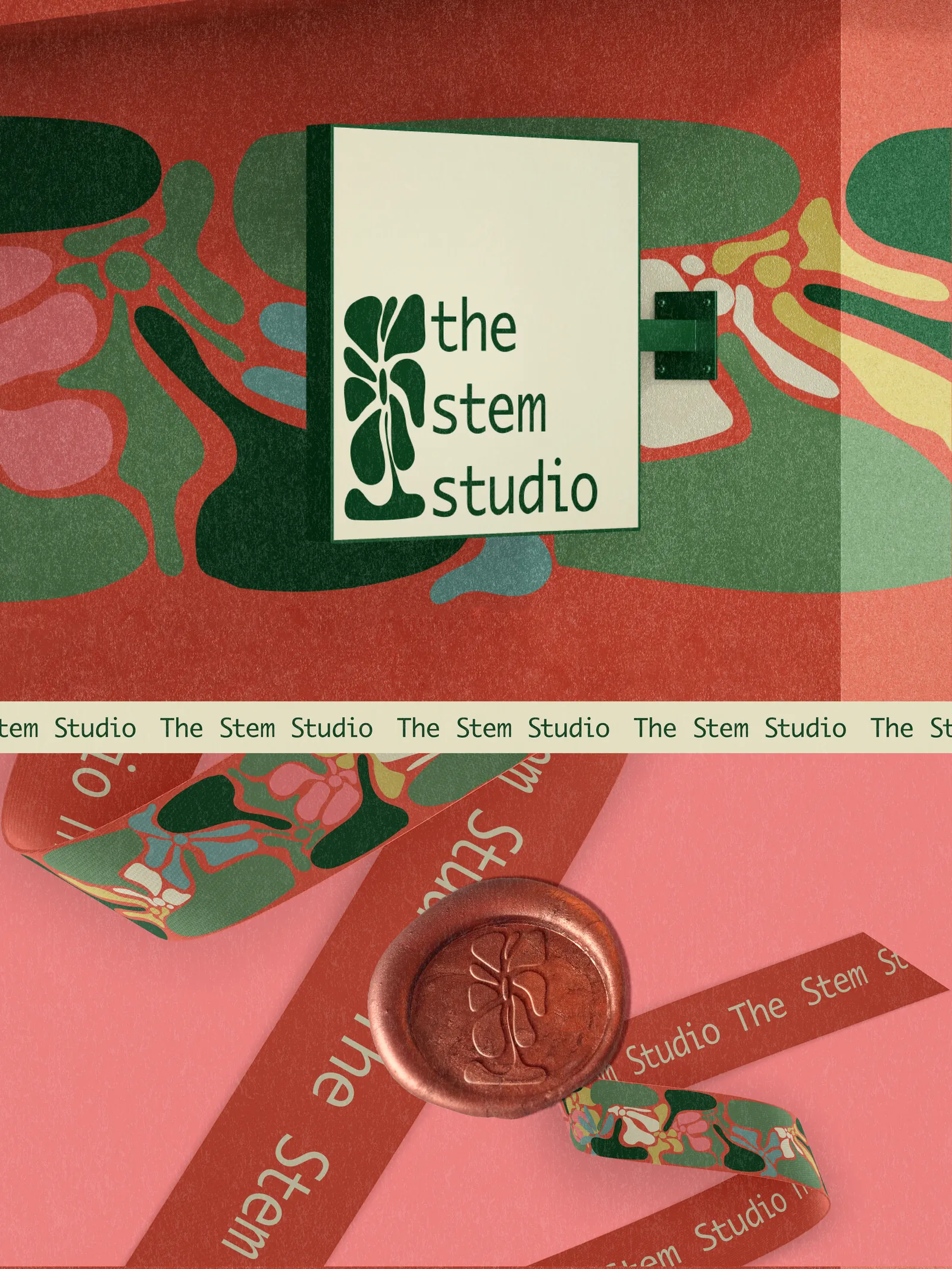
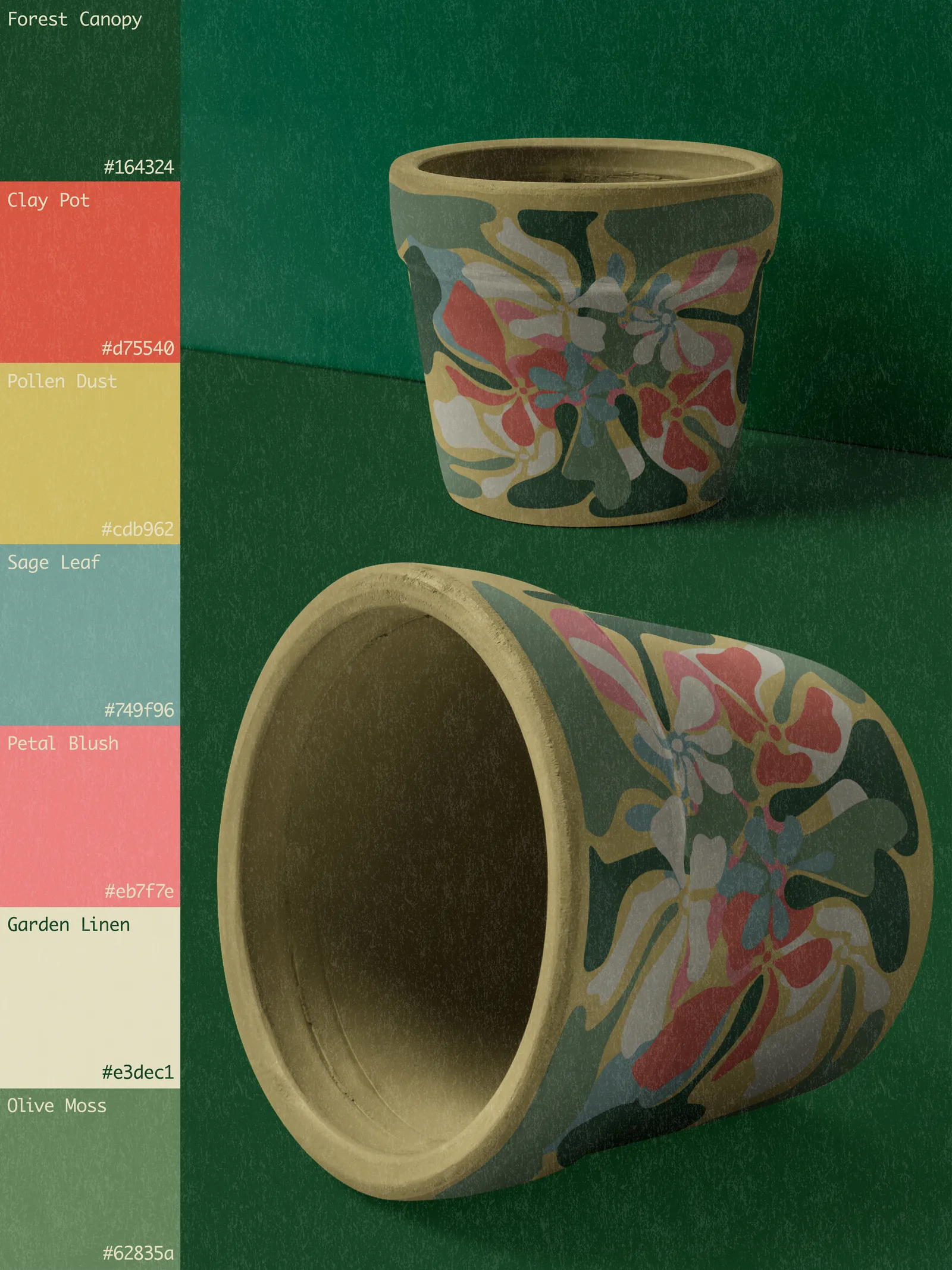
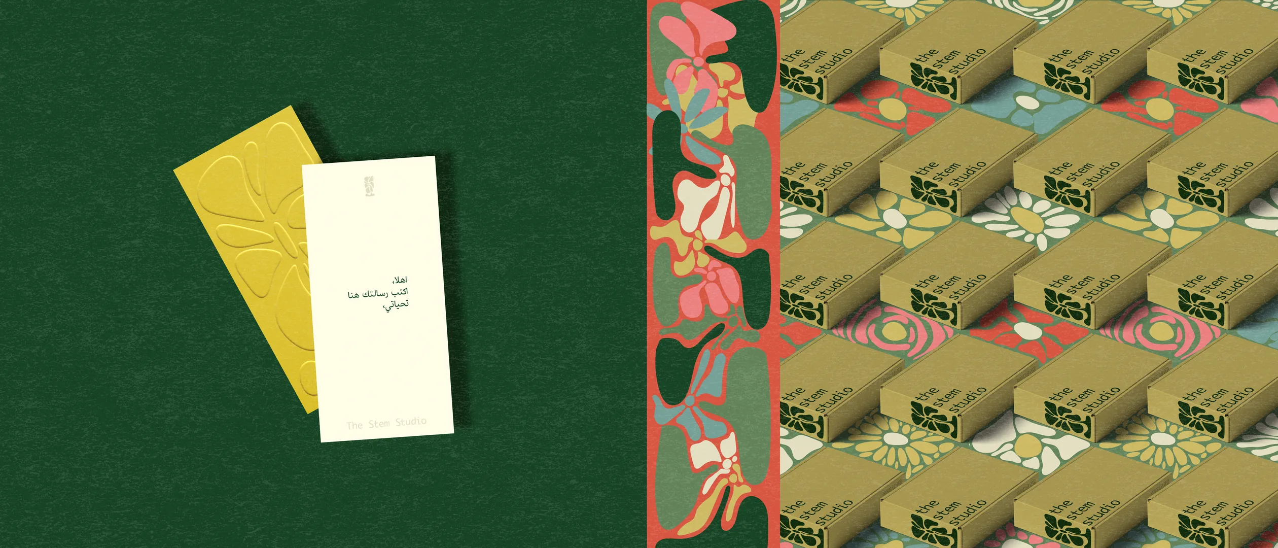
The Stem Studio's identity grows from one retro floral pattern: oversized blooms in coral, mustard, teal, and deep green, wrapped around everything the studio touches. Die-cut kraft boxes, embossed cards, printed ribbon, and a wax seal keep the brand physical and crafted: warm, nostalgic, and instantly recognizable on a shelf.
The problem
The studio was launching into a market where every florist looks the same: soft pastels, script logos, and interchangeable botanical clichés. It needed to be recognized instantly on a shelf or a feed, and to feel like a creative studio rather than just another flower shop.
The approach
I designed one hero pattern and made it do the heavy lifting: oversized retro blooms in a fixed palette, pushed through every tactile finish the brand could own. Die-cut windows on kraft boxes, blind emboss on cards, printed ribbon, a wax seal. The wordmark stays small and quiet so the florals always speak first.
Visual direction
- 01Retro-floral and bold
- 02Tactile kraft, emboss, die-cut
- 03One pattern, many surfaces
Gallery
Next project
Henna Raghad→