Henna Raghad
A vivid, plant-powered identity for a henna care brand: botanical greens, organic shapes, and Arabic lettering at its heart.
Overview
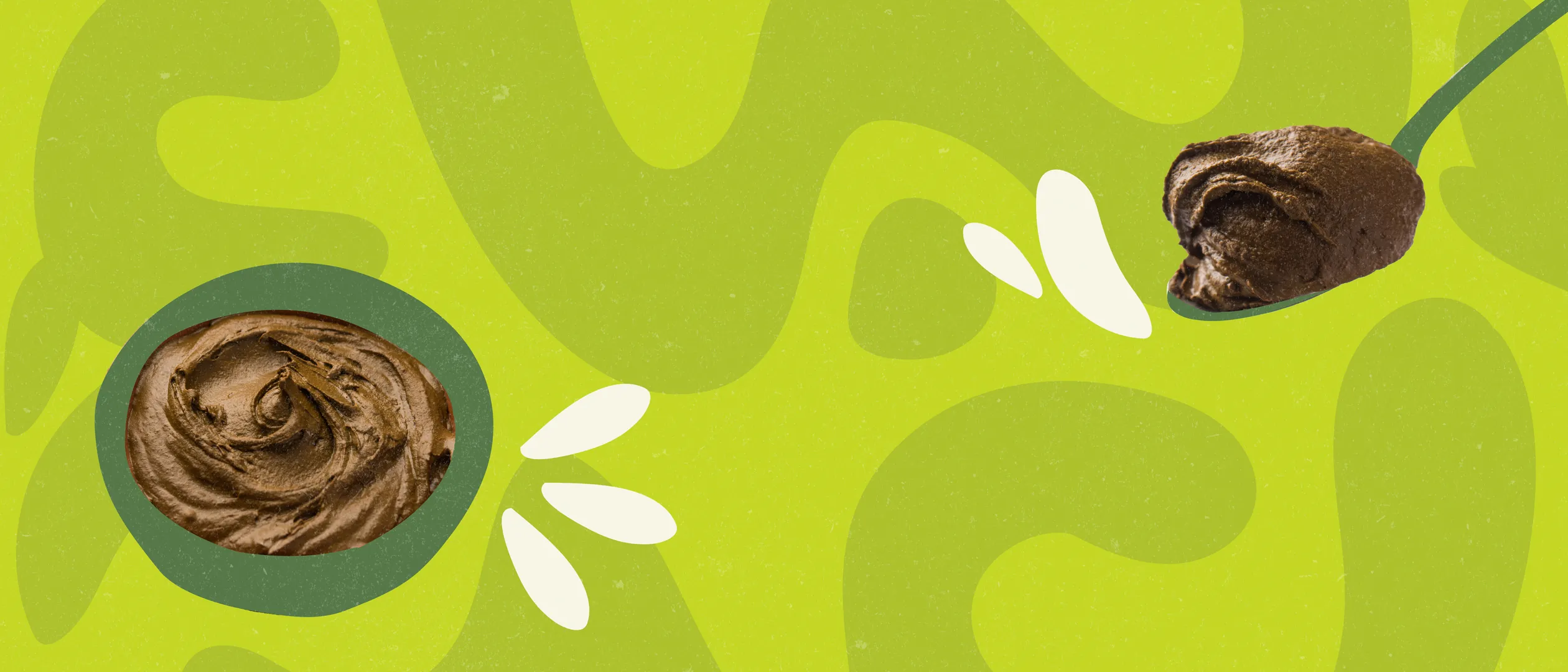
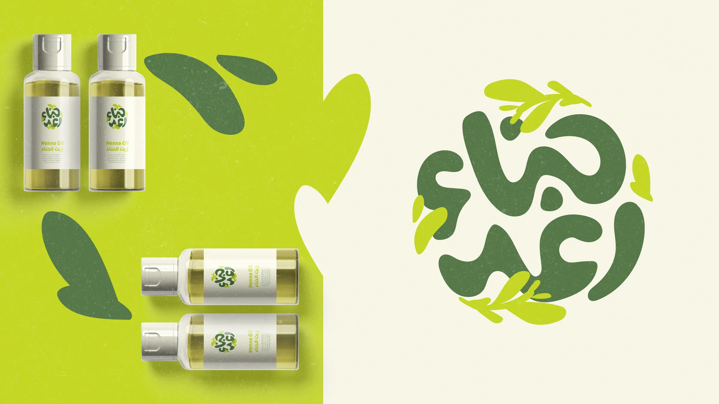
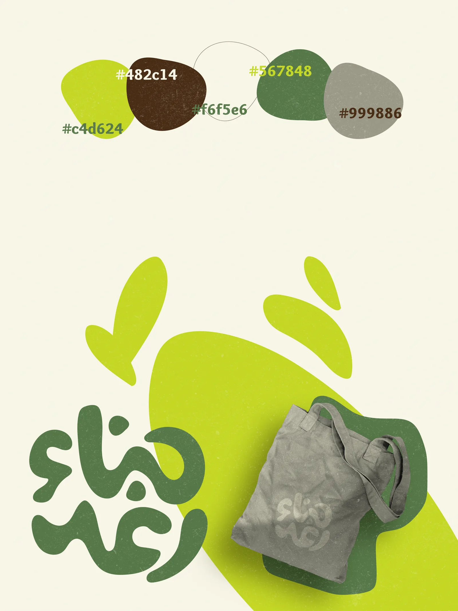
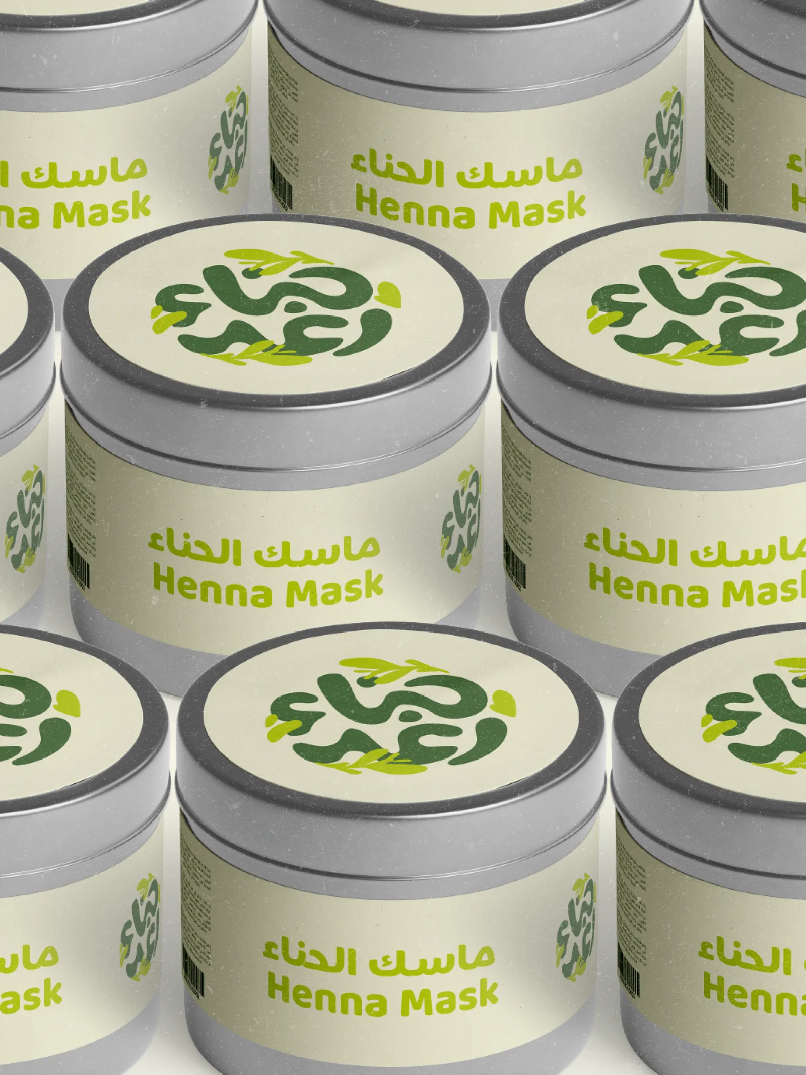
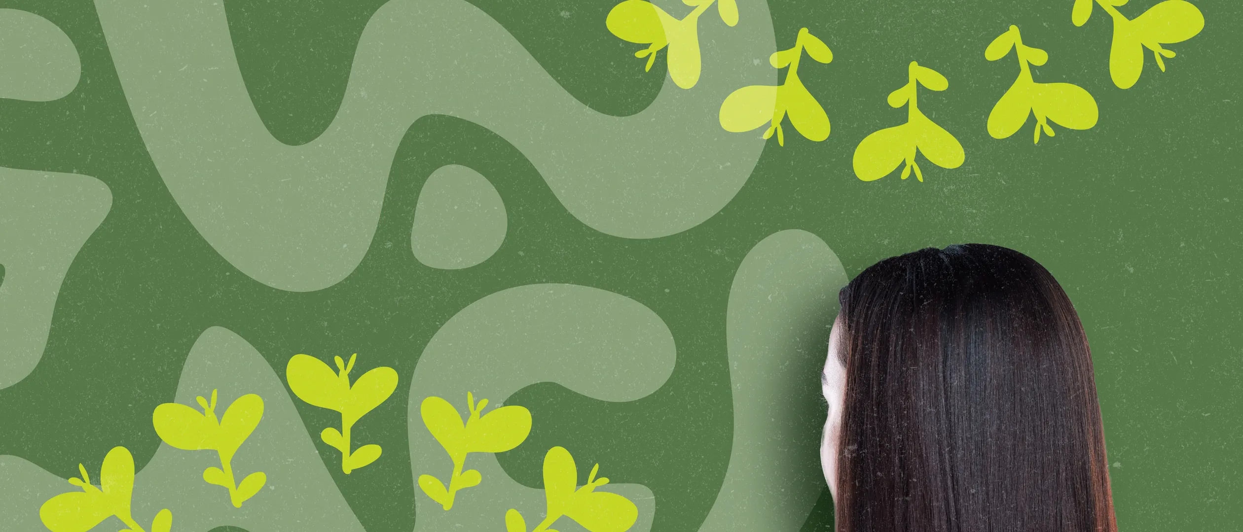
Henna Raghad treats henna as living plant care: a circular Arabic logotype wreathed in leaves, a confident palette of chartreuse and deep botanical green, and organic shapes that echo the paste itself. The system stretches across mask tins, hair oils, and totes while staying natural, vibrant, and unmistakably rooted in Arabic identity.
The problem
Henna carries deep tradition, and that heritage often traps it in an old-fashioned, occasions-only image. Henna Raghad needed to reach a younger audience as everyday plant-powered care, modern and fresh, without erasing the Arabic identity that makes the ritual meaningful.
The approach
I kept heritage at the center and modernized everything around it: the Arabic name drawn into a circular emblem wreathed in leaves, then a deliberate swerve away from expected earthy browns into vivid chartreuse and deep botanical green. Organic shapes lifted from the paste itself carry the system across tins, oils, and totes.
Visual direction
- 01Arabic lettering at the core
- 02Vivid botanical greens
- 03Organic, plant-grown shapes
Gallery
Next project
Maitchai→