Niqran
An earthy identity for a pottery brand: clay browns, glaze blues, and a mark stamped like a maker's seal.
Overview
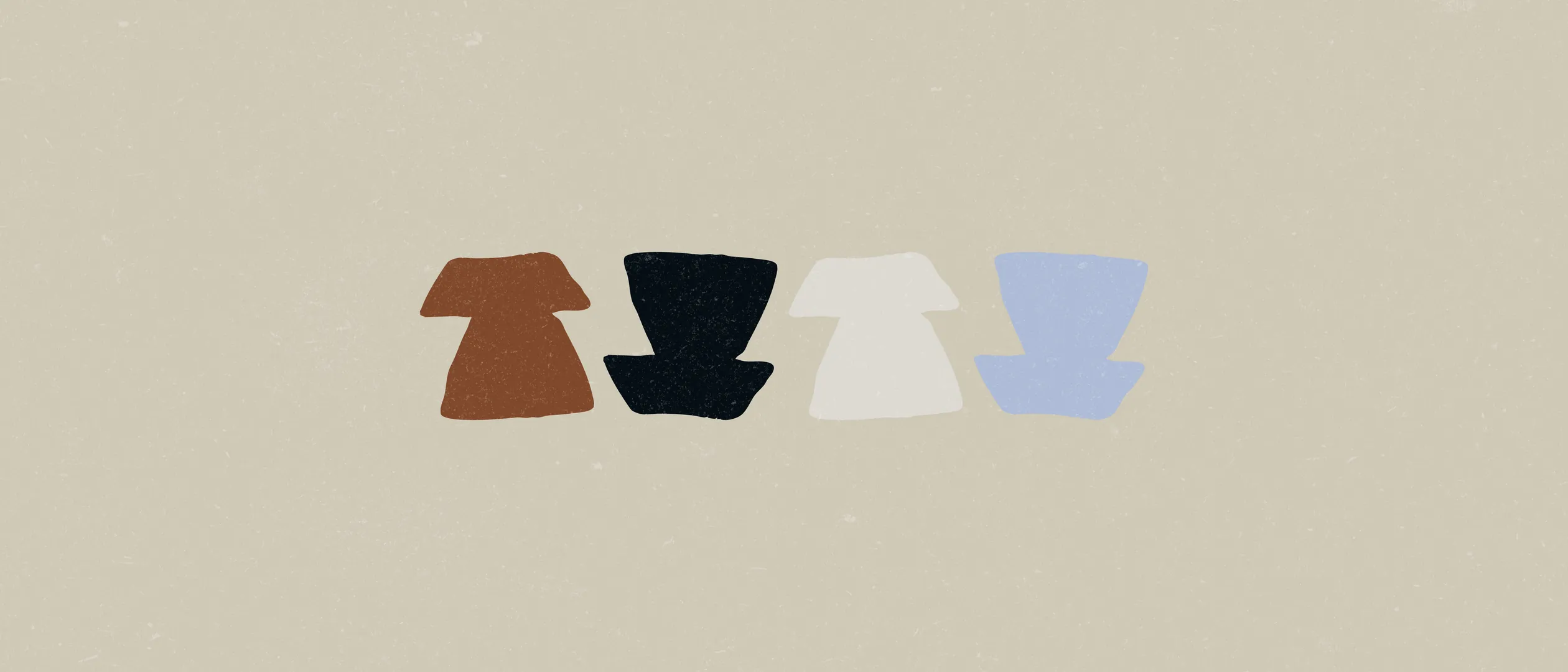
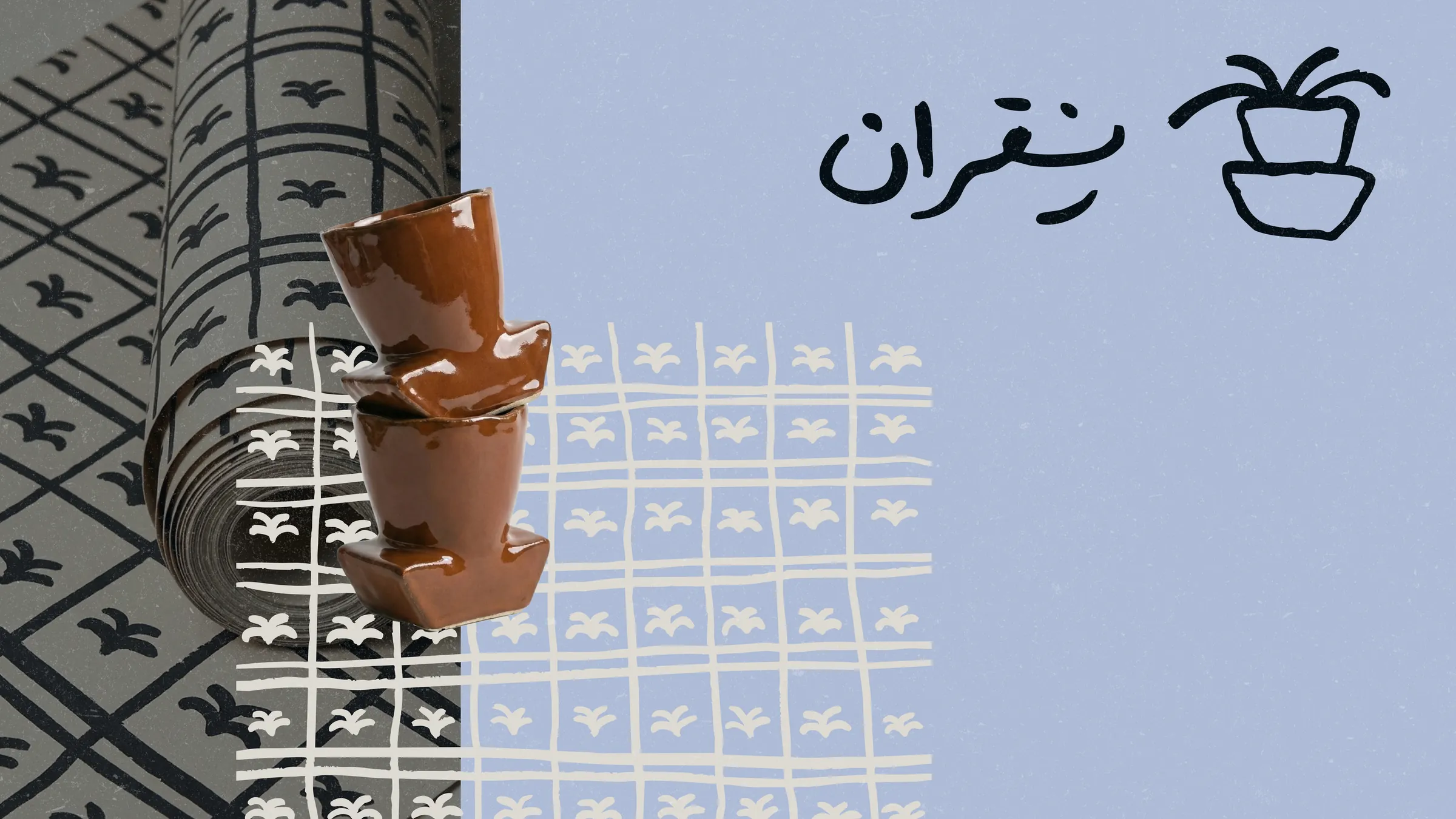
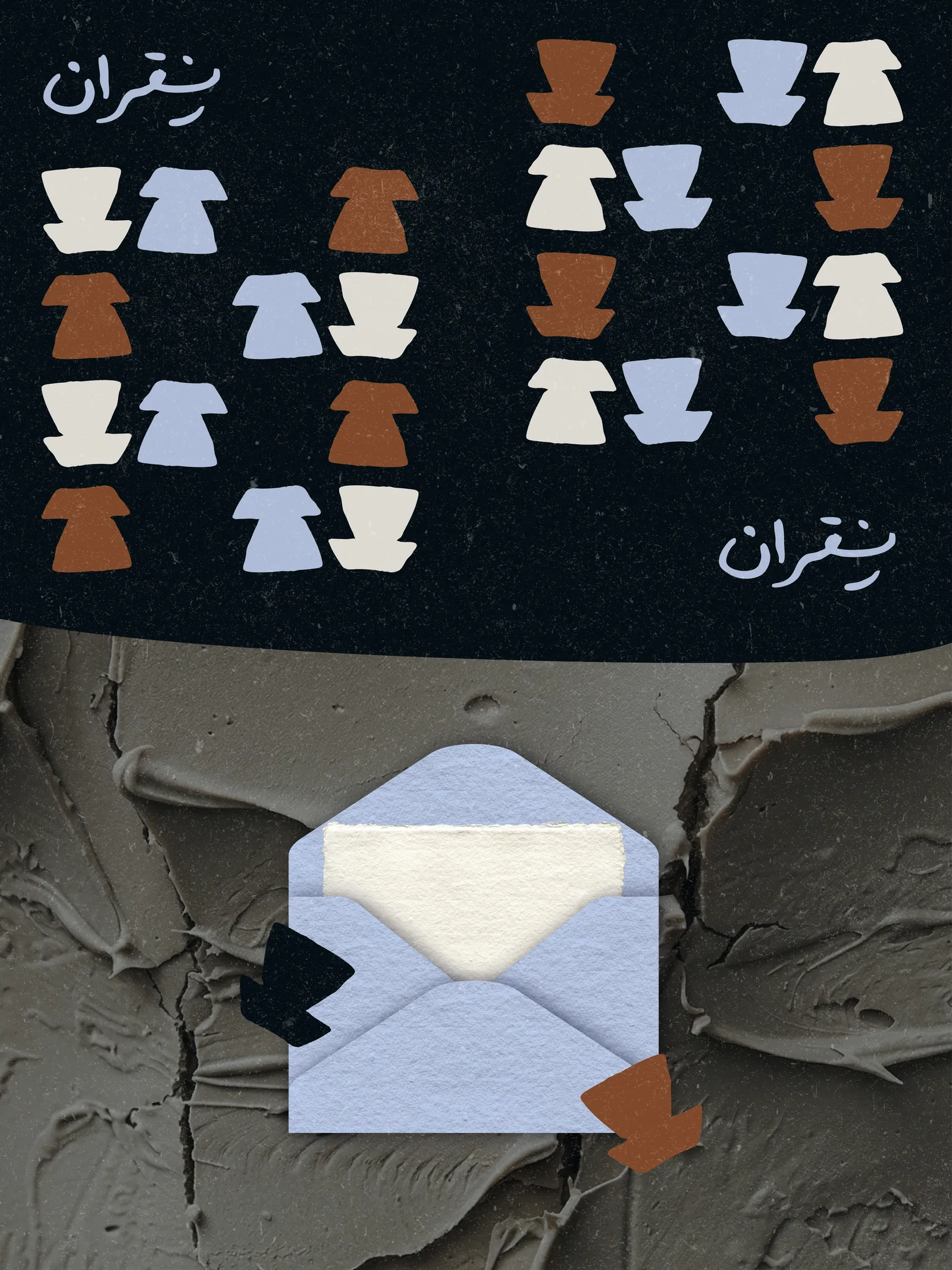
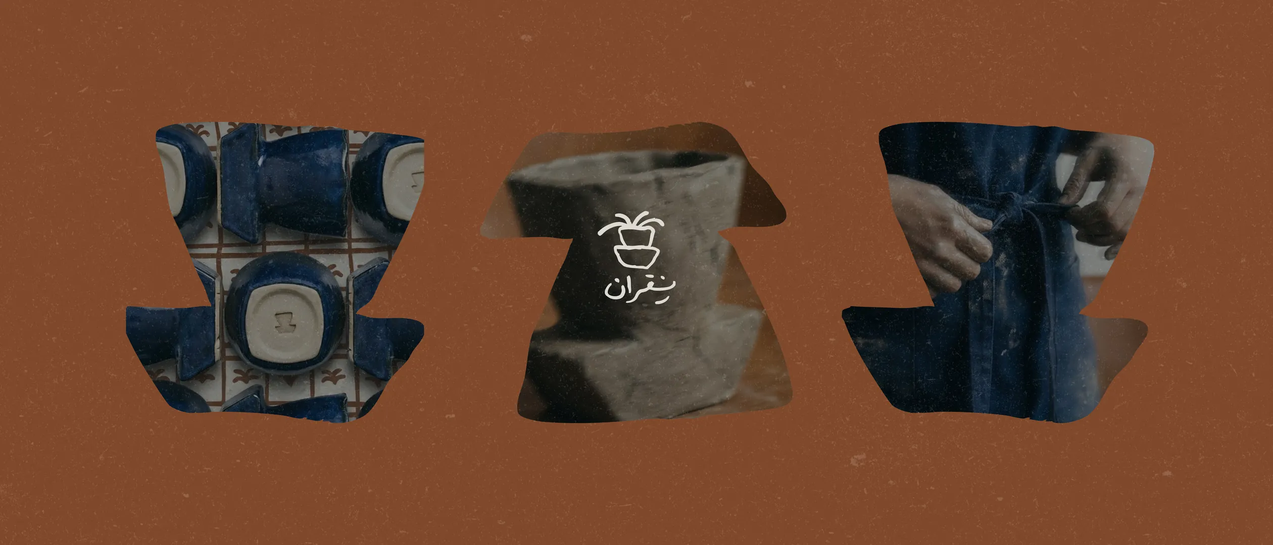
Niqran begins with the idea that a touch becomes a trace, the way a potter's hands mark clay. A stamp-like emblem holding a hand-sketched plant anchors a palette of clay brown, glaze indigo, and bone white, while vessel silhouettes repeat into patterns for fabric and wrapping. The result is handmade, earthy, and quietly expressive.
The problem
Every Niqran piece is shaped by hand, so no two are identical, a strength that conventional, polished branding would flatten into a flaw. The identity had to frame irregularity as the whole point, and feel as handmade as the pottery without tipping into rough or unfinished.
The approach
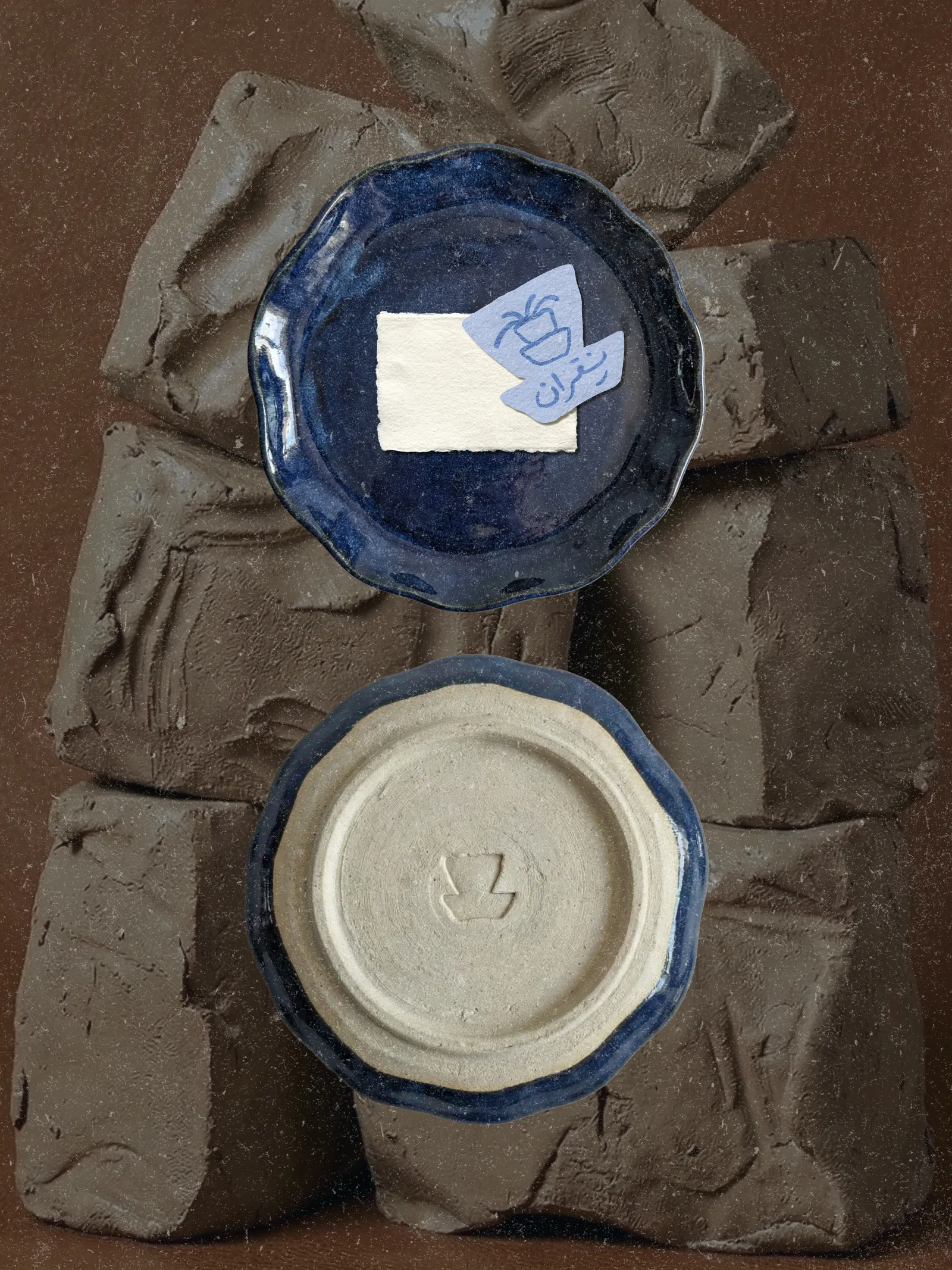
I built the brand on a single line: a touch becomes a trace. The emblem works like a maker's seal, a hand-sketched plant stamped inside a cup-shaped badge, in a palette taken straight from the studio floor: clay brown, glaze indigo, bone white. Vessel silhouettes repeat into patterns for fabric and wrapping, so even the packaging feels pressed by hand.
Visual direction
- 01Stamped like a maker's seal
- 02Clay browns, glaze blues
- 03A touch that leaves a trace
Gallery
Next project
Cake It Easy→