Cake It Easy
A sweet, playful identity for a cake brand: candy pastels, a whole library of hand-drawn desserts, and a holographic gradient mark.
Overview
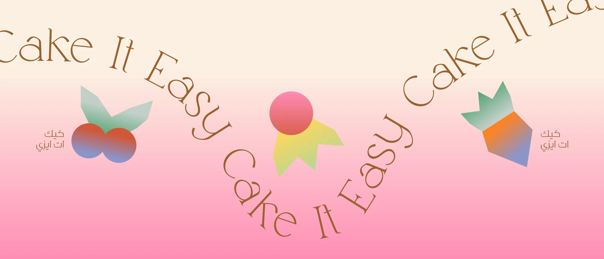
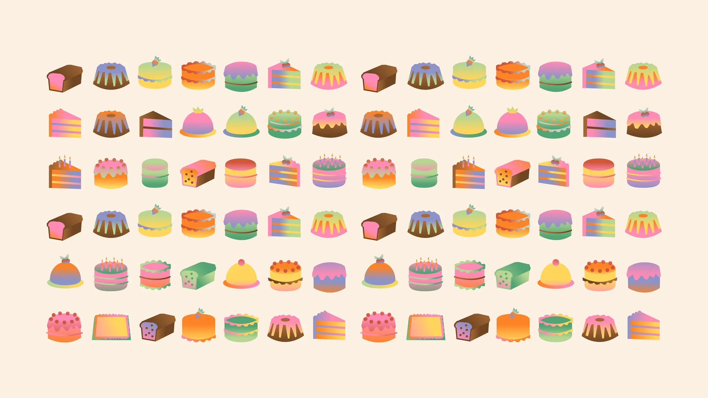
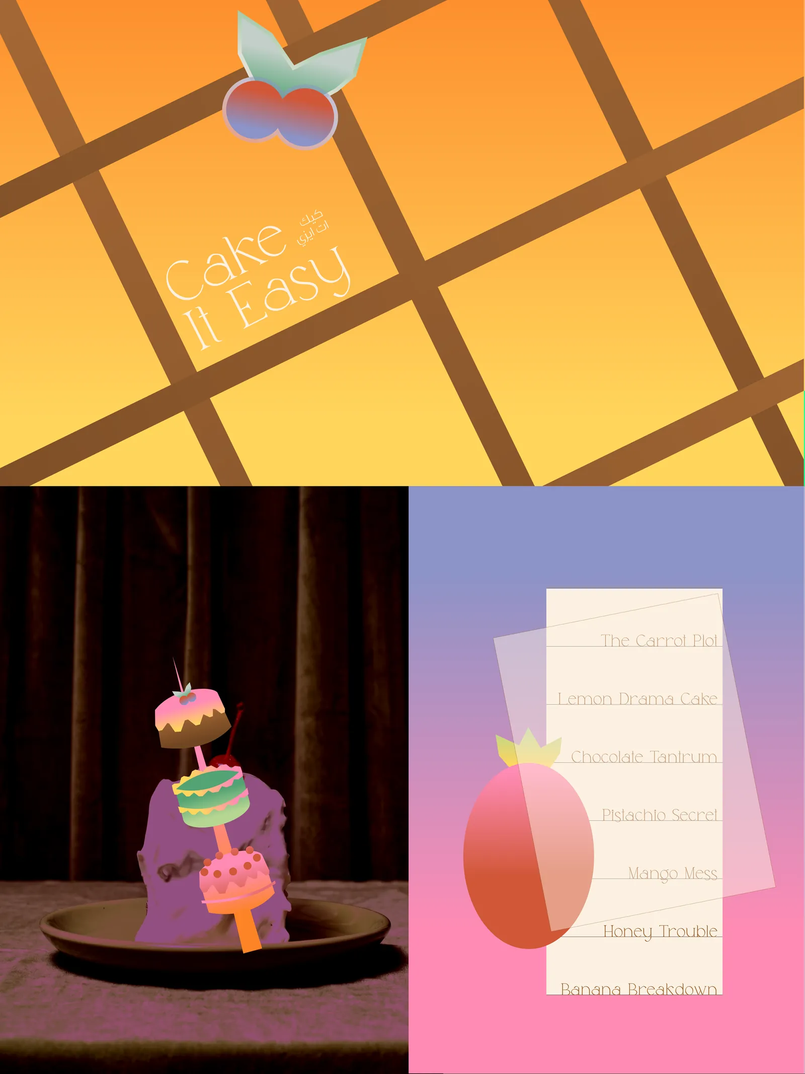
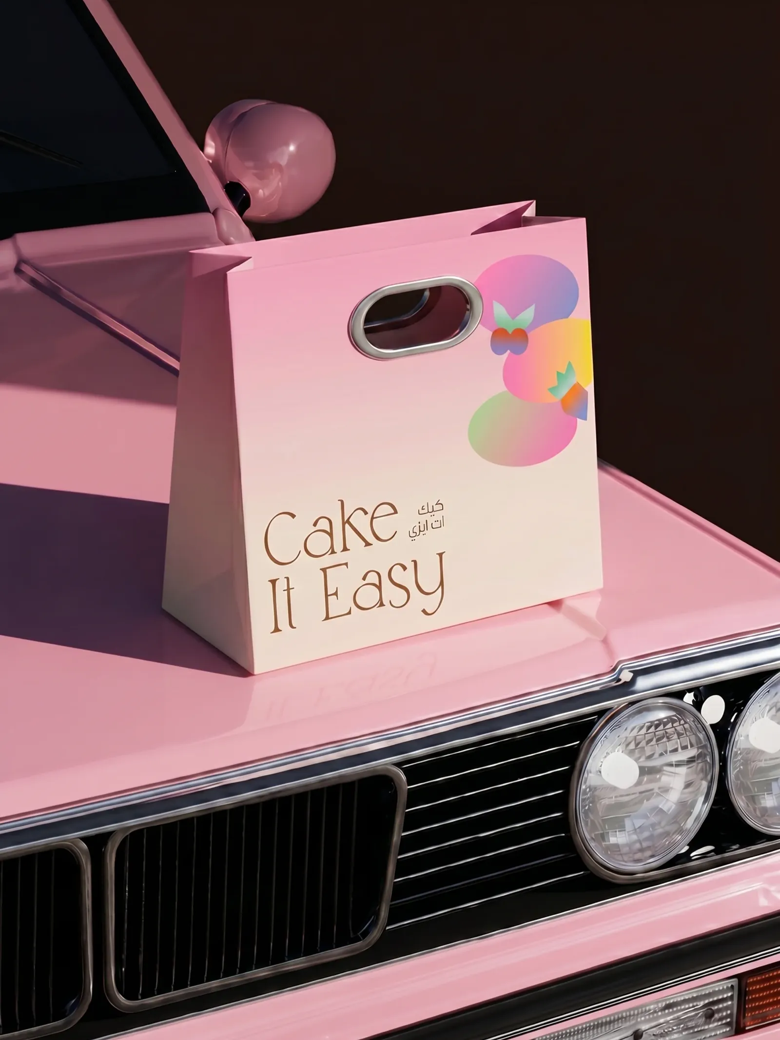
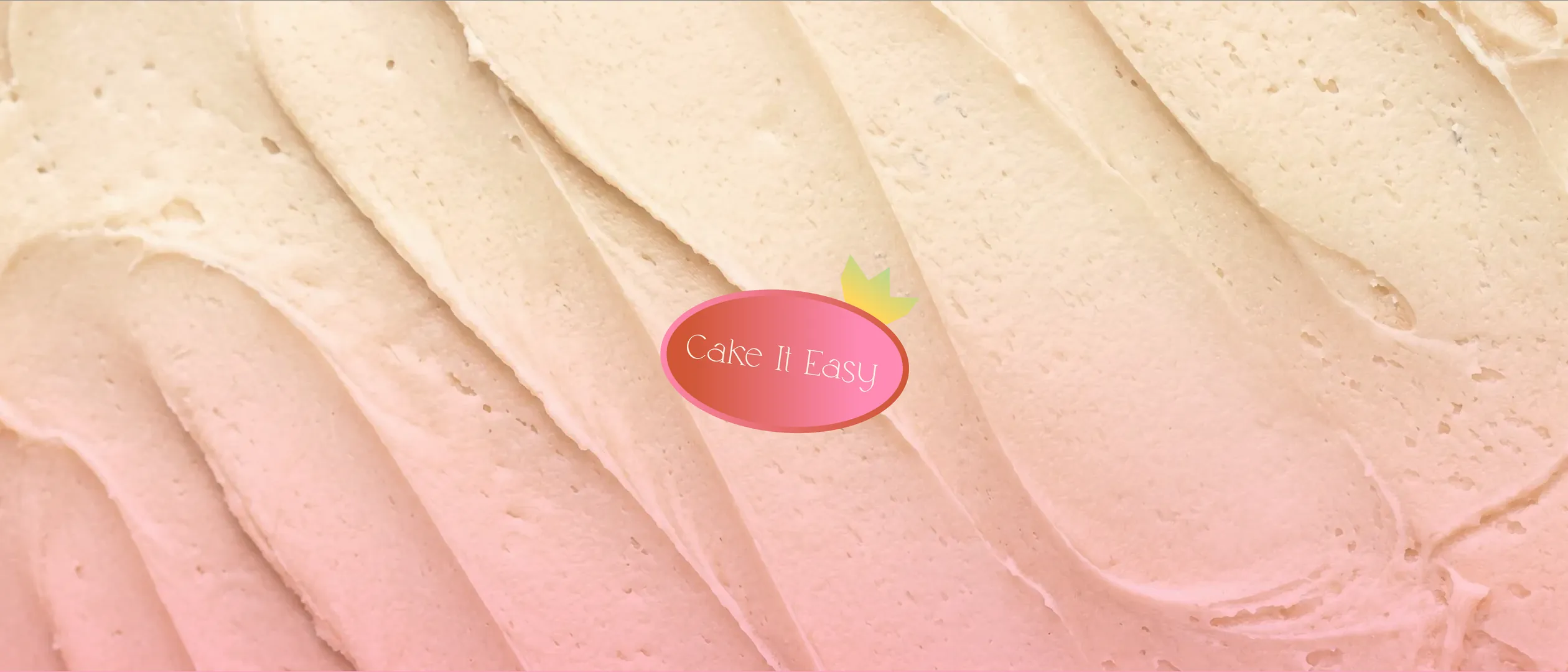
Cake It Easy turns a bakery into a feeling. The name plays on take it easy, and the identity follows: soft candy pastels, a warm hand-lettered wordmark in English and Arabic, and a holographic gradient mark that catches the light like sugar glass. A full library of hand-drawn cakes, slices, and bundts gives the brand endless pattern and personality across bags, boxes, and packaging, all styled with a dreamy retro edge.
The problem
A cake brand lives or dies on craving. Cake It Easy had to look as joyful and indulgent as what it sells, stand out in a feed full of minimal, beige bakeries, and feel personal in both English and Arabic, all without tipping into childish or cluttered.
The approach
I built the brand around abundance: a library of colorful hand-drawn desserts that can scatter across packaging, repeat into patterns, or stand alone as icons. A soft pastel palette and a warm bilingual wordmark keep everything friendly, while a holographic gradient mark adds a modern, collectible shine. Glossy pinks and a vintage-car photoshoot give the sweetness a nostalgic, editorial finish.
Visual direction
- 01Candy pastels with holographic shine
- 02A whole library of hand-drawn cakes
- 03Bilingual, playful, a little nostalgic
Gallery
Next project
The Stem Studio→