Maitchai
A playful bilingual identity for a matcha cafe: hand-drawn characters, crisp linework, matcha green, and a pop of purple.
Overview
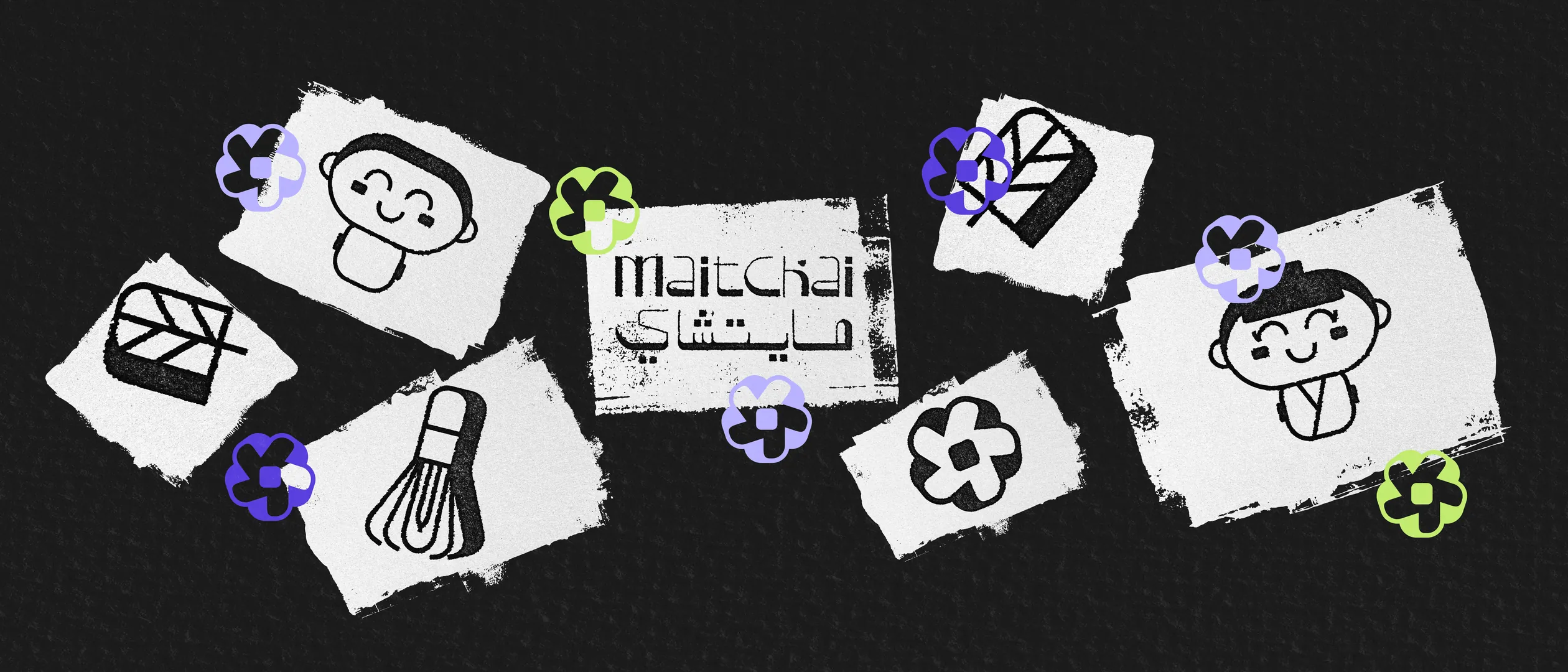
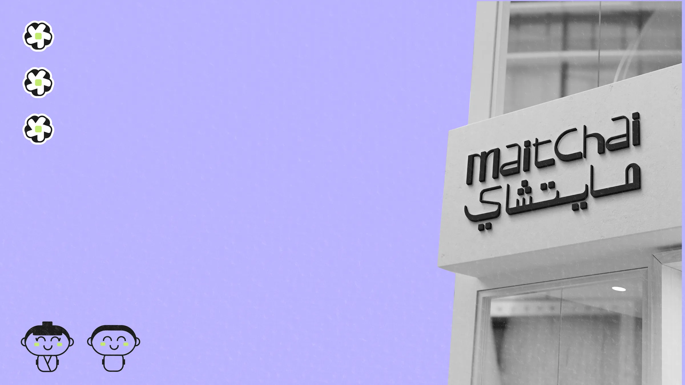
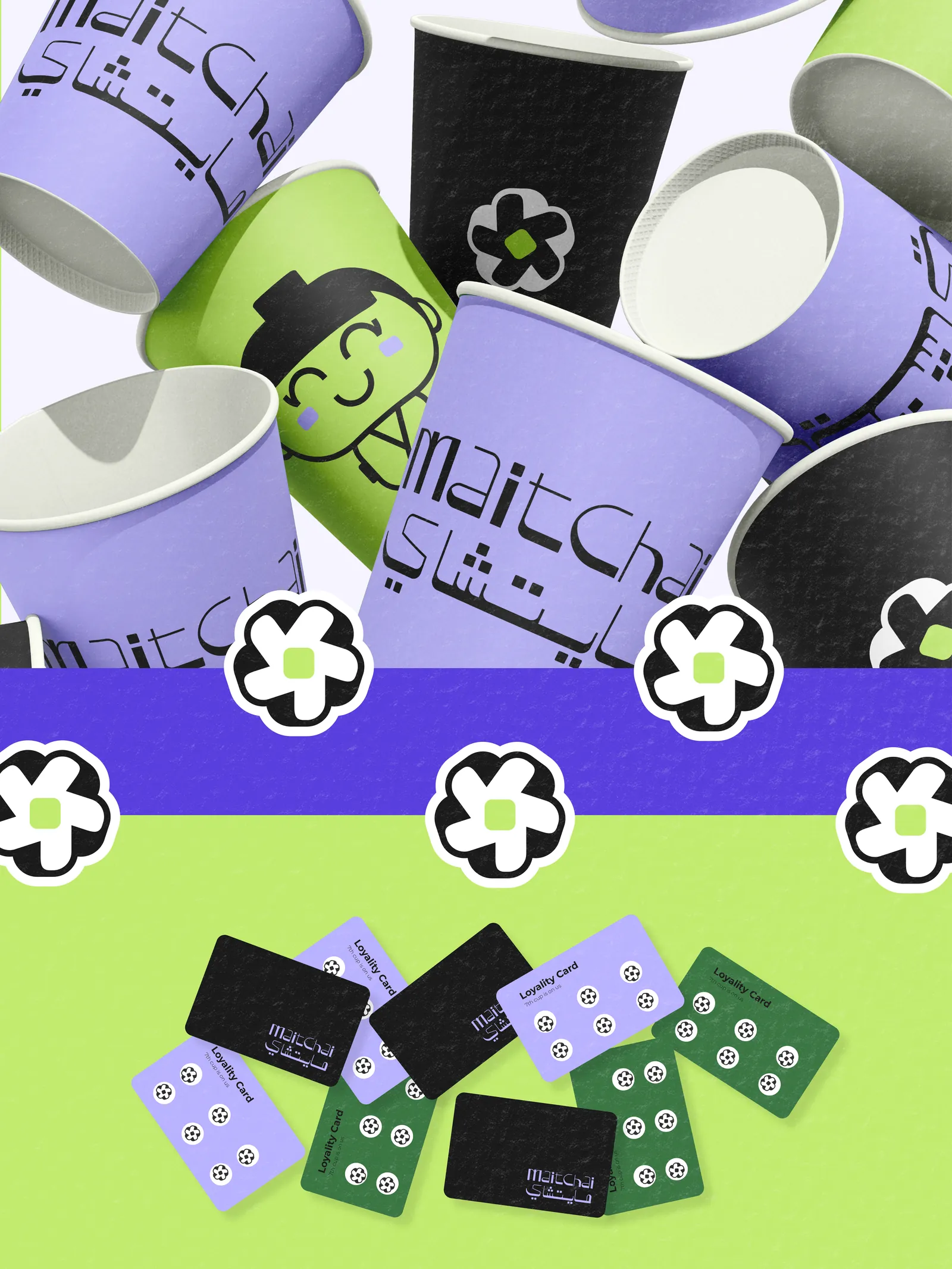
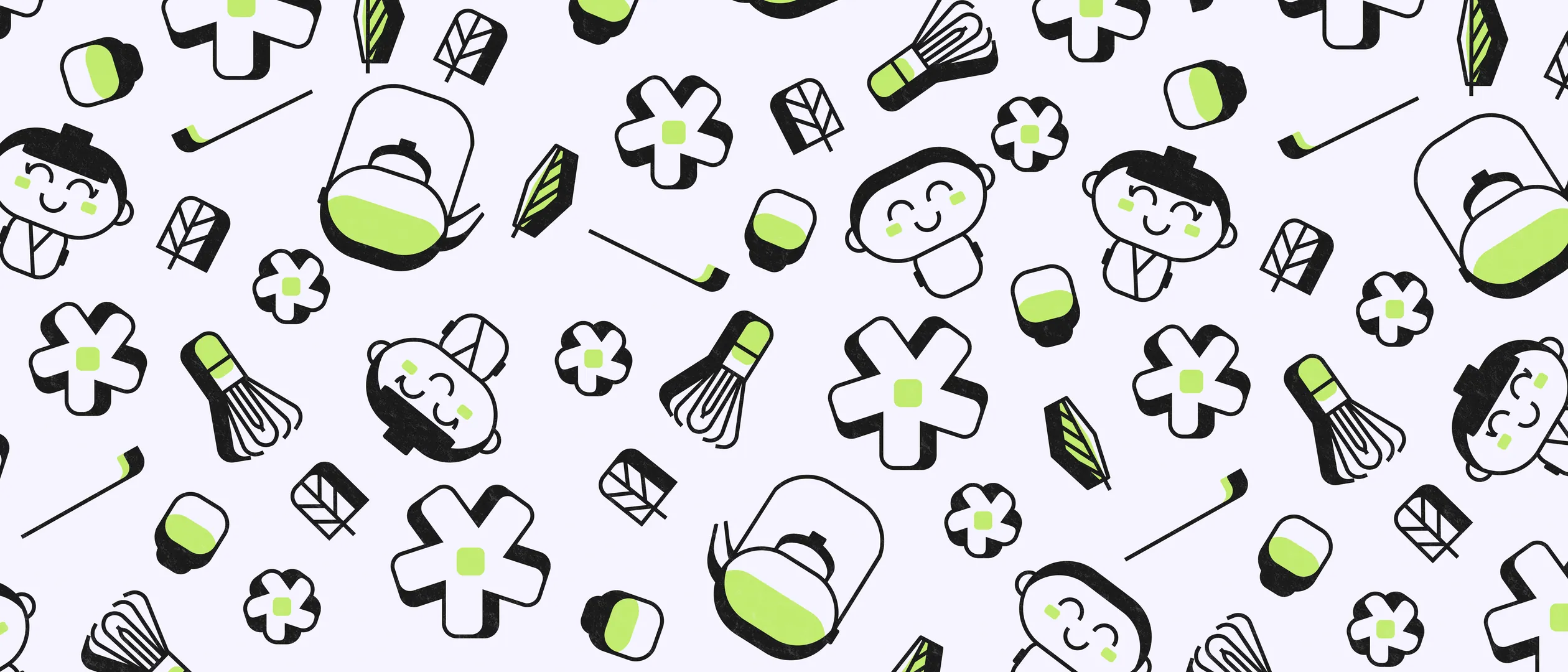
Maitchai pairs a bilingual logotype, Latin and Arabic side by side, with hand-drawn characters and icons borrowed from Japanese tea culture: whisks, teapots, and blossoms. Crisp black linework lets matcha green and an unexpected lavender pop across cups, loyalty cards, and tags. Fun at first glance, polished up close.
The problem
Matcha cafes come in a uniform: minimal, beige-and-green, quietly Japanese. Opening into that crowd, Maitchai needed to feel instantly friendly and local, speaking Arabic and English with equal confidence, and memorable enough that first-time customers ask about the cups.
The approach
I gave the brand a personality before a palette: a cast of hand-drawn tea characters and icons that can decorate, explain, and joke. The Latin and Arabic logotypes were drawn as one matched pair, and crisp black linework lets matcha green, plus a deliberately off-script lavender, pop on cups, loyalty cards, and tags.
Visual direction
- 01Playful, hand-drawn characters
- 02Bilingual Latin and Arabic logotype
- 03Matcha green with a purple pop
Gallery
Next project
Niqran→